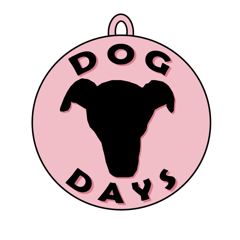
For my logo final I decided to make a logo for my blog. I have an outline of my dog, Rosies, face as the center of the design, it’s significant because it’s not just an outline of a dog it’s my dog and it’s what my blogs kind of all about. The words “Dog Days” are significant because it’s the name of my blog and what I want to kind of be the main tag of it. I have the words and Rosie’s face outline in a circle so I thought it would be a fun touch to add a little hook at the top to make the whole logo look like a dog tag. I think it brings it together as a dog centered blog and makes it more significant than just being a circle. For my final I added some color, I decided on a rosy pink because, well, my dogs name is Rosie. I also copied the words I already put on there and changed the color to a different hue of the color I’d originally chosen and placed it behind the black lettering to make a sort of shadow. I changed the order of the layers so the pink words were behind the black. Using the arrange > send back doesn’t work for this because then the pink words would be behind everything and then you wouldn’t be able to see them. Keeping the colors similar helped keep it a simple look and helped it kind of blend together and match. I also did the same thing for my dogs face outline.